
Overview
Danz Monitoring Fabric (stylized as DMF) is a network monitoring software created to provide network visibility and monitoring capabilities. It enables network operators to capture, analyze, and monitor network traffic for performance, security analysis, troubleshooting, and compliance.
Tools Used
Figma, Illustrator
My Role
UX Designer
As the sole UX designer, I was in responsible for the creative direction, from user research and concept development to prototyping and implementation. I also worked closely with cross-functional teams, including product managers, developers, and stakeholders, to create an collaborative and inclusive design process.
Initial Scope - Landing Page (Before Redesign)
As the product was moving from the previous code-base to React, an opportunity to redesign key user workflows was given to the front-end team. As a result, there was an opportunity to explore a redesigns of multiple key features and workflows throughout the DMF product, one of which being the Landing Page.
Visible UX issues:
Outdated user interface
Stats shown are irrelavent in showing current state of network
Usability Issues: difficult to find relavent metrics to begin troubleshooting
Lack of user guidance / next steps
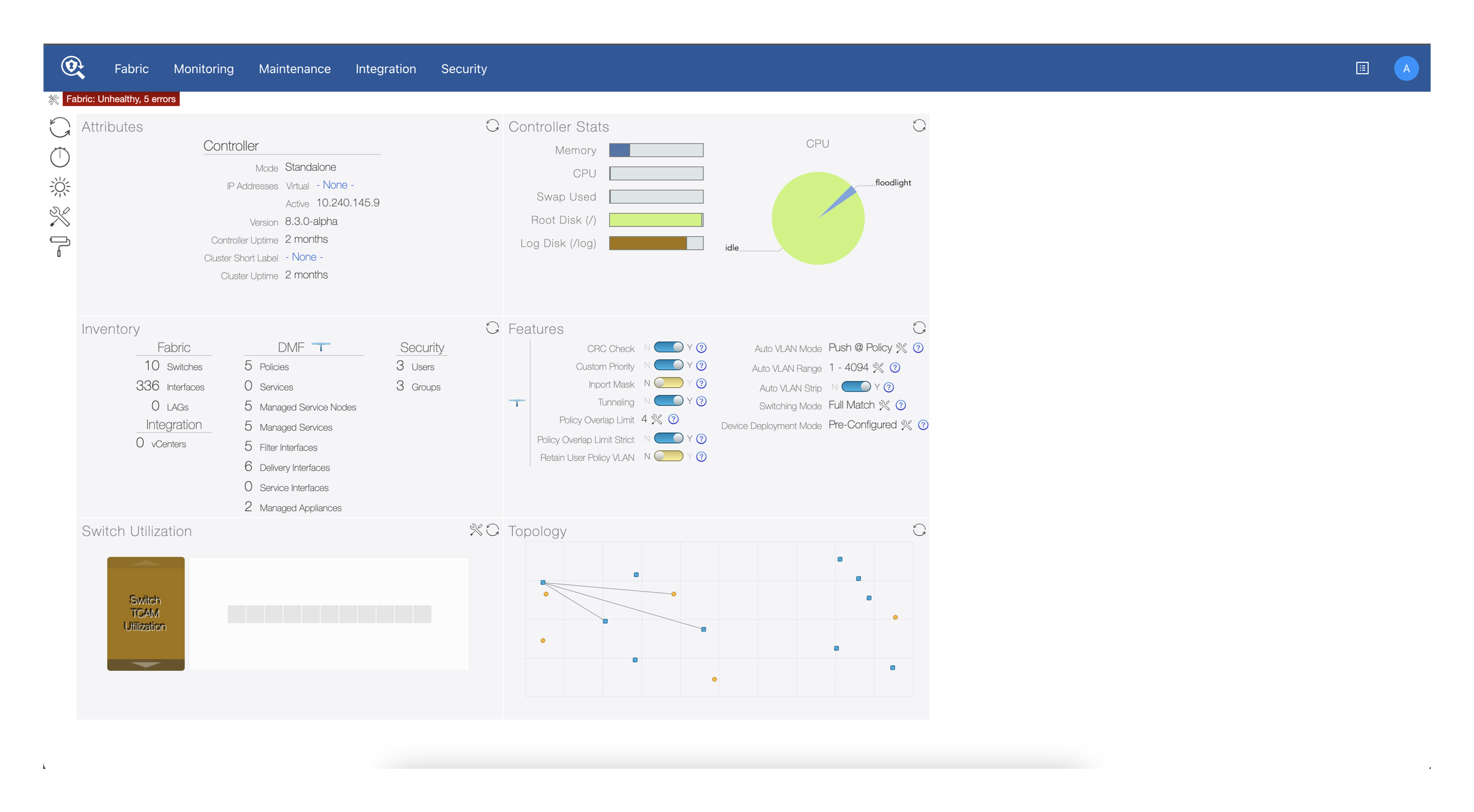
The previous UI of the dashboard/landing page of DMF.
Understanding User Needs & Pain Points
User Research
Due to the nature of the company, direct access to customers for feedback was difficult and uncommon in the field. As a result, a majority of the direction and feedback comes from two groups of individuals: Sales Engineers, those that work closely with customers in assisting with troubleshooting, weekly updates, etc. and the Project Managers + Development team.
Sales Engineers:
Having direct contact with customers on a weekly basis, Sales Engineers helped provided clear and concise insight into common day-to-day workflows, common troubleshooting scenarios, highly requests features, and information that is currently lacking in the current interface, that may not be documented prior to the meetings.
Project Managers + Developers:
The internal team provided guidance into kickstarting and introducing common workflows that users would come across, along with assisting with feasibility of designs, “low-hanging fruit” recommendations regarding information displayed, common user workflows, and overall clarity in a highly technical domain.

Notes taken during the meetings with Sales Engineers (left) and the Project Management team (right)
White boarding Sessions
Due to the nature of the company, direct access to customers for feedback was difficult and uncommon in the field. As a result, a majority of the direction and feedback comes from two groups of individuals: Sales Engineers, those that work closely with customers in assisting with troubleshooting, weekly updates, etc. and the Project Managers + Development team.

A combination of “throwaway” designs mocked up to spark discussion, along with low-fidelity sketches to portray the ideas being brought to the table at the time.

A sample user flow diagram demonstrating how a user commonly navigates through the software
Target Goals of Redesign
Provide clear data metrics for users to fully understand the current state of their network at a glance.
Present clear entry points guiding users to act on any errors and warnings that may occur.
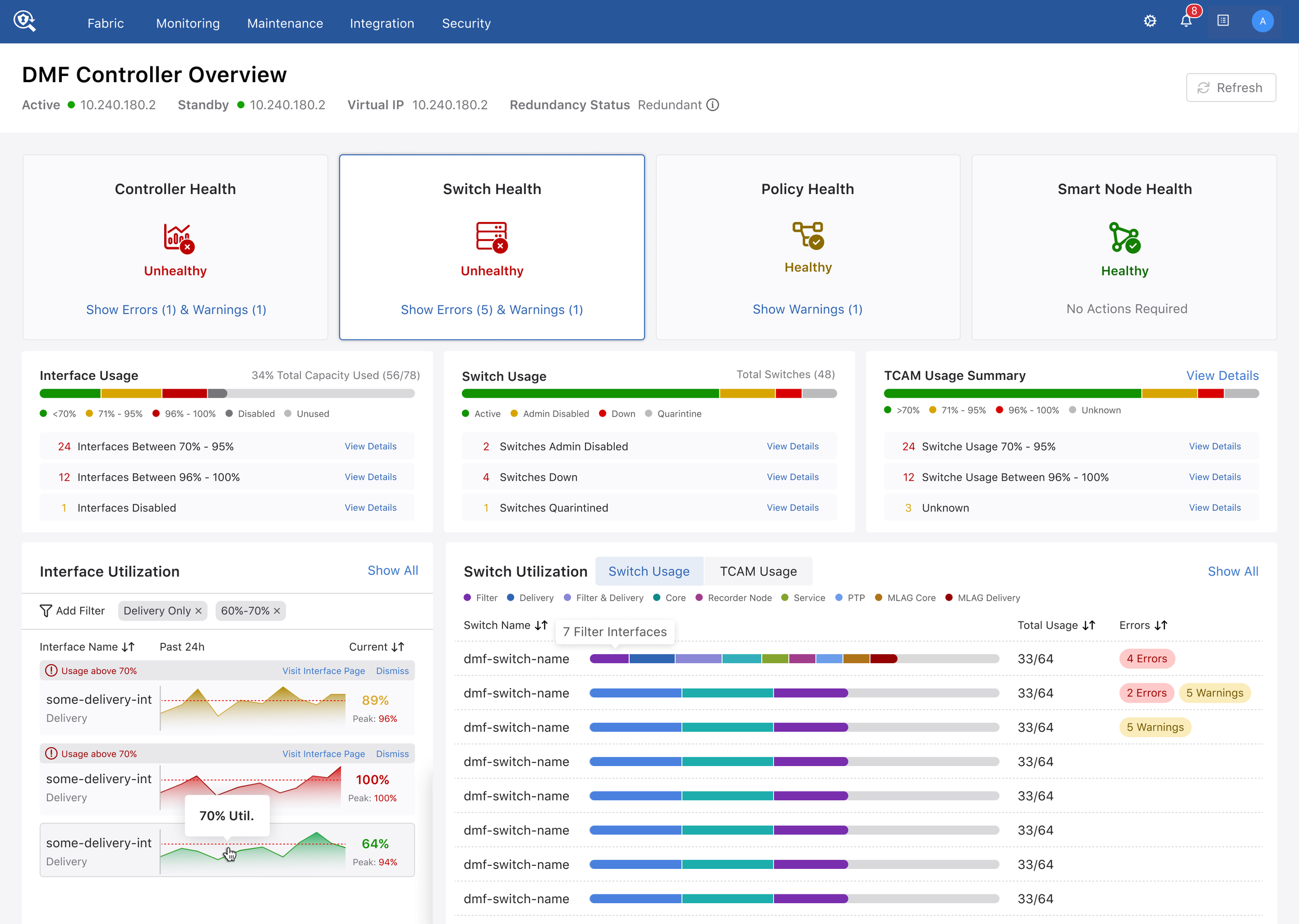
Resulting Design - 4 Instances, 1 Dashboard

A summation of the different health metric states and its unique display data that follows.
Network Visibility At A Glance
With each health card acting both as as a navigation tab, as well as a section summary of the network, the resulting structure allows for a quick understanding of any potential errors and warnings that may arise throughout the day. with each card containing different states - Healthy, Warning, and Unhealthy, the user is able to differentiate both how many errors the network has at any given time, along with the parameter of which the error takes place.

A closer look at the different alert status’ that can be shown to users
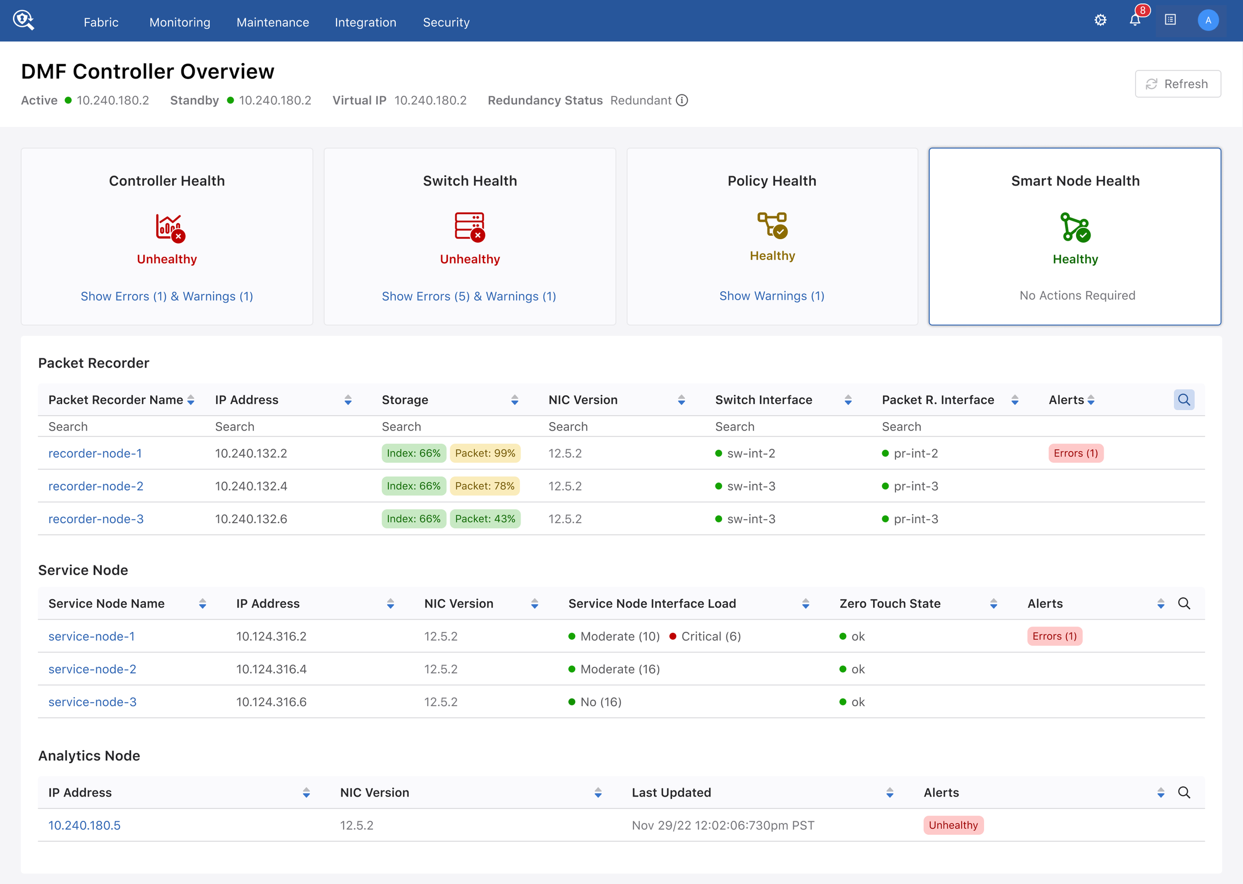
Looking At Entry Points
The 4-tab card system also allows users to easily navigate towards key areas of the product we have identified.
With each health card acting as a navigation tab, the end result creates a navigation system that shows relavent metrics to whichever the user is interested in at the moment, while also providing a general health summary of the different areas of the network to the user.


Validation
As previously noted, direct customer access to user testing and feedback was a difficult avenue. As a result, the main guidance for validation of both direction and design comes internally, from the Sales Engineers, as well as other internal stakeholders.
Confirmation with Sales Engineers
Throughout the design process, outreach to the Sales Engineers for feedback was essential in better understanding and validating design assumptions that were made by the team. As a result, a lot of our guidance depended on first-hand feedback and direction from those directly involved with our end users. Despite not being able to directly user test with users, constant feedback and input from the Sales Engineering team proved to be a suitable replacement.
Confirmation with Project Managers and Developers
Due to the nature of the domain and the extensive knowledge that is required to properly understand user workflows, requirements, etc. I highly depended on the team to properly guide me through the more intricate workflows and thought processes. As a result, their knowledge regarding user requirements, workflows, were only second to the Sales Engineers due to the years of experience both from Arista and the networking domain as a whole. Alongside this, validation regarding feasibility and scope definition was assisted from the team as well.
Confirmation with Designers
Despite being the only UX Designer on the DMF Product, reaching out to the designers from other product teams was imperative in assisting in exploring other avenues of visual design. The designers provided valuable critique in both visual design as well as high level workflow avenues that may already exist in Arista as a whole, leading to a more cohesive product suite under the Arista umbrella.